Tuesday, April 18, 2017

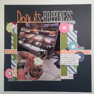
Donuts = Happiness

I've been scrapbooking for a while now - 18 years! I started in 1999 while I was in college. I wanted to make an album for my boyfriend of the fun things we'd done together. He must have liked it since he's now my husband. 

I've seen many changes in this hobby. From the small section in Wal-Mart that started me off to big local scrapbook stores, to online shopping, this hobby has seen many changes. A big change I've noticed, especially recently for me personally, is a lack of knowing anyone who scrapbooks. Well, that's not quite true. I do know some people but, for whatever reason, it's not something many of them are currently doing. I was never one for big crops, but I like having someone to socialize with sometimes!

We got a wonderful new music teacher at school this year. As much as I loved him, I found that I loved his wife even more. She's got a great sense of humor, loves Doctor Who, and wanted to start scrapbooking! When a weekend came up that both of us were looking for something to do, scrappy plans just fell into place. After all our fun, I had to scrapbook it - of course!


We started our Saturday with donuts because every good scrappy weekend needs junk food! There is a wonderful local donut shop in our town now. I love to go there whenever I have a proper excuse. My waistline can't handle "it's morning" as a good reason. 

Donuts = Happiness uses Family Frenzy by Bella Blvd. It's a relatively new collection compared to most of my stash having come out in summer of 2015. I really liked the bright colors when I bought it. The donut paper was an obvious choice for this layout.  I punched them with a circle punch and used them accents all over the page. 

A Project Life 6x6 pad (Desktop maybe?) and some BoBunny Double Dot for the background completed my paper choices. I found some glitter/holographic domed stickers that reminded me of enamel dots at the dollar store. The wide variety of colors worked very well. Paper tape by Bella Blvd, Thickers, and inking with Distress Ink completed my layout. 


Thursday, April 13, 2017

When You Don't Like a Layout

I know it's happened to most of us. We make a layout. We spend time (and usually a fair bit of money) working hard to preserve a memory. Finally, we finish, sit back, and frown. There's something wrong. That happened to me recently. I followed a sketch on 2PeasRefugees and was unhappy with my results. In all honesty, the sketch wasn't necessarily one that sang to me to begin with. It had large circles - a shape that's not inspired me much recently. I wanted to try it though Bloom, Dear One was the result.


Elizabeth had recently tried on her new Captain American dress to wear to a comic book convention we were meeting a friend at later that day. I snapped this quick picture and thought it captured how she's starting to grow up. I signed and dated the back and brought it downstairs to put into the 2017 album. And then I couldn't stop thinking about it. I uploaded the picture to the challenge and still couldn't stop thinking about it. It felt off...not quite done. But, what was wrong?

After much thought, it came down to two things. Just a note - this is me. It's my thought process. I'm sure many would look at this page and think it's just fine. The conclusions I drew after dwelling on it though are related. Most of my layouts include inking around the edges. Since I wanted this to be a lighter layout, I didn't ink. I wasn't sure what color to use anyway. Black or brown would be too heavy. With the variety of spring colors, I didn't know what to use unless I used every color. This was a decision I made from the beginning before I starting cutting into my paper.

The other thing though, I think is related. The plaid "weave" of the background paper is very open. There's nothing wrong with that. Since I didn't ink though, it feels like the entire layout is open. Like it continues to flow off the pages into the world around it. I finally figured that out after staring at this photo for a while. It needed a border - something to keep everything in. I asked for suggestions on 2PR and finally decided to go with just a plain pink cardstock board. I trimmed off two sides just a bit and matted the entire layout.


I am so much happier with the overall look now. Finally, it feels done. I did nothing else but add that border (and the date in the lower corner apparently). It's finished now. I have it in my stack of layouts to bring downstairs and insert into albums. Now, I'm quite happy with it. Have you ever changed a layout before? Either in a minor or major way? What did you do? Are you happy with the end product after the change? 

Here are some detail shots before I go. Have a great scrappy day!


Tuesday, April 11, 2017

Wish

One thing I added to my March Build Your Own Kit was a 3x4 wooden card I bought from Two Peas in a Bucket way back when.  I hadn't recently started Project Life, but I was just starting to branch away from the card kits and adding more unique items. Sadly, this card was too thick to easily slip into a pocket. It's sat there, staring at me, waiting patiently to be used.

Finally, it's layout came. I adore how it works on this page. Even though it's a picture of my daughter sleeping as an infant, I wrote to my eight year old daughter. I've done a couple pages like this and years later it ends up being my favorite journaling.

In addition to the wooden card, the pink paper is from BoBunny's Double Dot collection. The stripes and vellum are Shimelle Laine's Starshine collection with American Crafts. The yellow star paper is Basic Grey's Oh! Baby Boy. The glitter lace paper is from so long ago I don't know who made it. From my kit I've pulled washi, sequins, my Citrus Twist stamp, and my Amy Tangerine roller stamp.


Monday, April 10, 2017

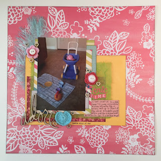
Picnic Time

My March Build Your Own Kit was once again used for this layout. It features a photo of my daughter's indoor picnic. She used to always pull down the kitchen towel and set things up on the other side of the island. I'd come around the corner and find her pouring tea for her animals or sharing food with her toys. Those were such happy memories that I just had to document them.

My base paper is from Amy Tangerine's Better Together collection. I bought the paper pad and have hardly used it. I need to pull some more papers. I love the colors used there. I also used papers from Shimelle's Starshine collection, Bo Bunny's Double Dot, and some lime green mulberry paper I had in my stash.  Remember when that was all the rage?


The embellishment clusters all feature something crocheted from Bella Blvd and wooden hearts from Studio Calico. I used stickers from my kit by October Afternoon for my title. 


I'm finally done with with my Heidi Swapp wood veneer words! I'm so happy to use them up. They look so much better on my pages than hanging in my scrapbook room. I also used the Citrus Twist stamp I pulled out. I think it was just perfect for this picture.


My last cluster featured a blue Bella Blvd feather. I couldn't fathom how to use those way back when they arrived in my Bella Blvd warehouse box. Now, I just love the softness they add to a layout. I really hope they last. 


What do you think? I have more pages to show you from my kit, plus the April Build Your Own Kit had also been pulled and I've been busy scrapping with that one too. So much scrappy fun. Spring break is just around the corner!

Saturday, April 8, 2017

Hello, Soccer Mom

Well, it was bound to happen at some point. This non-athletic woman became a soccer mom. I know next to nothing about soccer. We signed my daughter up with a friend and they played together for three seasons (A fourth they were on different teams but that is the season-that-shall-not-be-named.) it was a lot of fun to hang out with my friend while our kids played. There is little funnier than watching five year olds attempt to kick a soccer ball. Sadly, it looks like my daughter may have inherited my lack of athleticism. Soccer is a thing of the past now that they split teams by gender. She didn't want to play without her friend. 

For this layout I used my March Build Your Own Kit. The paper is by Basic Grey, ribbon by Making Memories, hello by Heidi Swapp, soccer embellishment from the Project Life soccer theme kit, letter stickers by October Afternoon, and various random things that I generally can't recall from where. A lot of those embellishment come from a variety of kit clubs I subscribe/subscribed to at some point. After a few months, I take everything left from the kit and split it up by color. 

For spending two years watching my daughter play, this is the first layout I've ever done. I love how it turned out. It perfectly captures a time in our lives that likely won't appear again. That's what scrapbooking is all about, isn't it?


Sunday, April 2, 2017

Mmm...Bacon

What a month! It's been busy at school and home. I've been scrapping with some kits I've made but have been slacking on the sharing and blogging. Let's get right to it.

This layout I made with my March BYOK. Check out the video of what's in my kit here.  My daughter drew a picture of a dinosaur thinking about bacon. She loves dinos and bacon. I thought it was such a funny combo! I trimmed it down from the 9x12" construction paper to a more usable size for me. I rarely scrapbook non-photo layouts so this was different for me. I love how it turned out though!


I have these wooden tags I got with a kit. I don't recall which because I've had them a while. It may have been Freckled Fawn. I didn't think the natural wood quite worked so I colored them with some Distress Ink. I dived into my baker's twine stash too. 


Since I colored the tag, I needed to color the Studio Calico wood veneer stars. I added punched tabs, enamel dots, and a word sticker to each embellishment cluster as well. My daughter was so surprised to see her artwork as a scrapbook page. She was grinning from ear to ear!